At WWDC 2025, Apple unveiled Liquid Glass — a new design language and unified visual theme for macOS, iOS, watchOS, and tvOS. It will debut this fall with version 26 of Apple’s operating systems.
I’ve already begun adapting Posterino to the Liquid Glass look, and I have to say, I like what I’m seeing. The new aesthetic gives content more breathing room and subtly pushes controls into the background. This post offers a quick glimpse of what’s taking shape on my developer desk.
Document Window
The bulk of the Liquid Glass adoption work naturally goes into the document window.
This is where the new design language shines: the document — the thing the user is working on — becomes the clear focus, while controls fade into the background. You simply see more of your work.
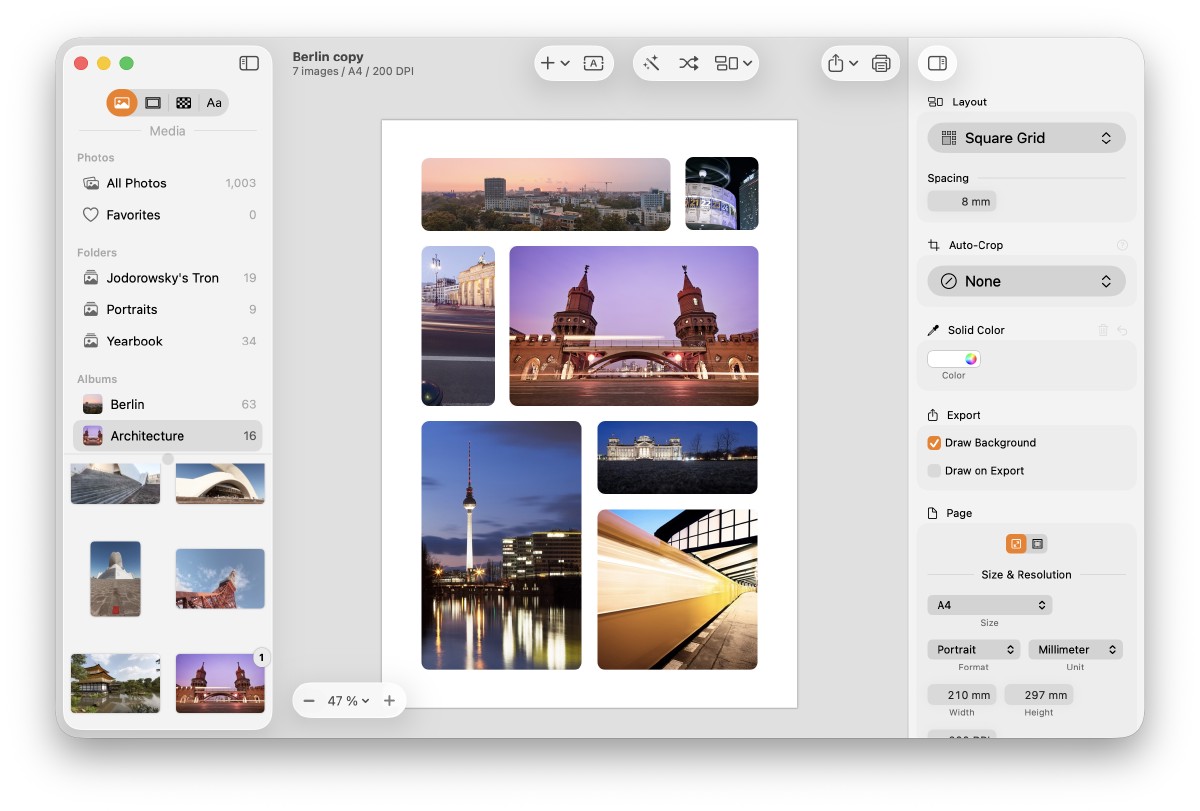
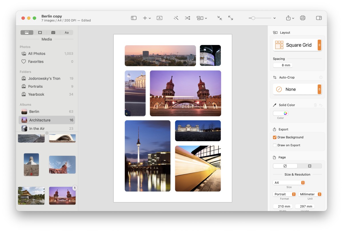
With the new look, there’s no longer a hard separation between the toolbar and the canvas. The sidebar and inspector now float above the content, their translucent materials letting the canvas subtly shine through.
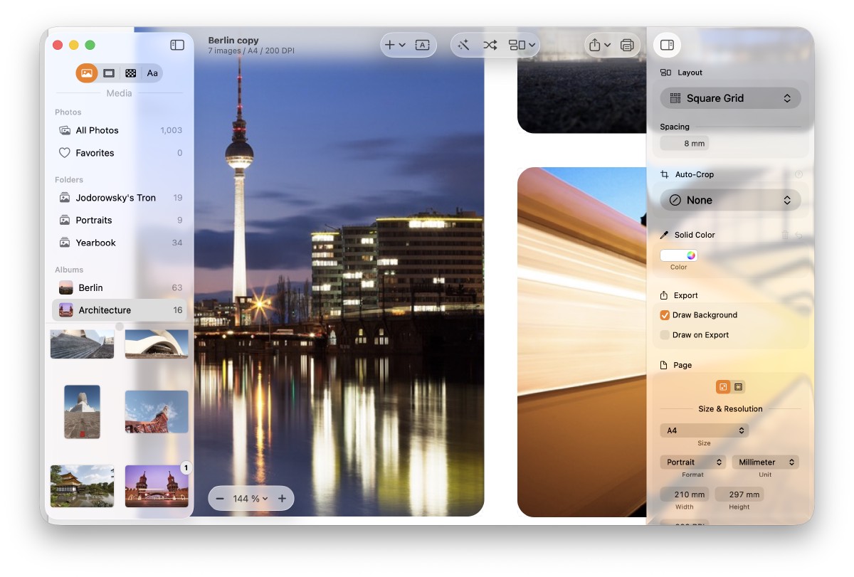
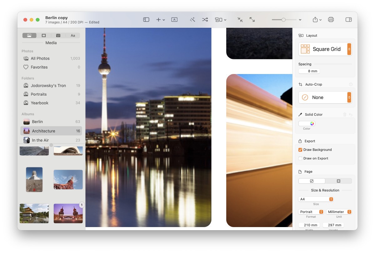
The hierarchy between content and controls is clearer, yet the boundaries are softer. The content takes center stage.
I also used this opportunity to declutter the toolbar, reducing the default tools. The zoom control, for example, moved from the toolbar onto the canvas, and toolbar actions are now grouped visually.
Template Picker
The template picker is the first thing every user sees — and another chance to give content more breathing room.
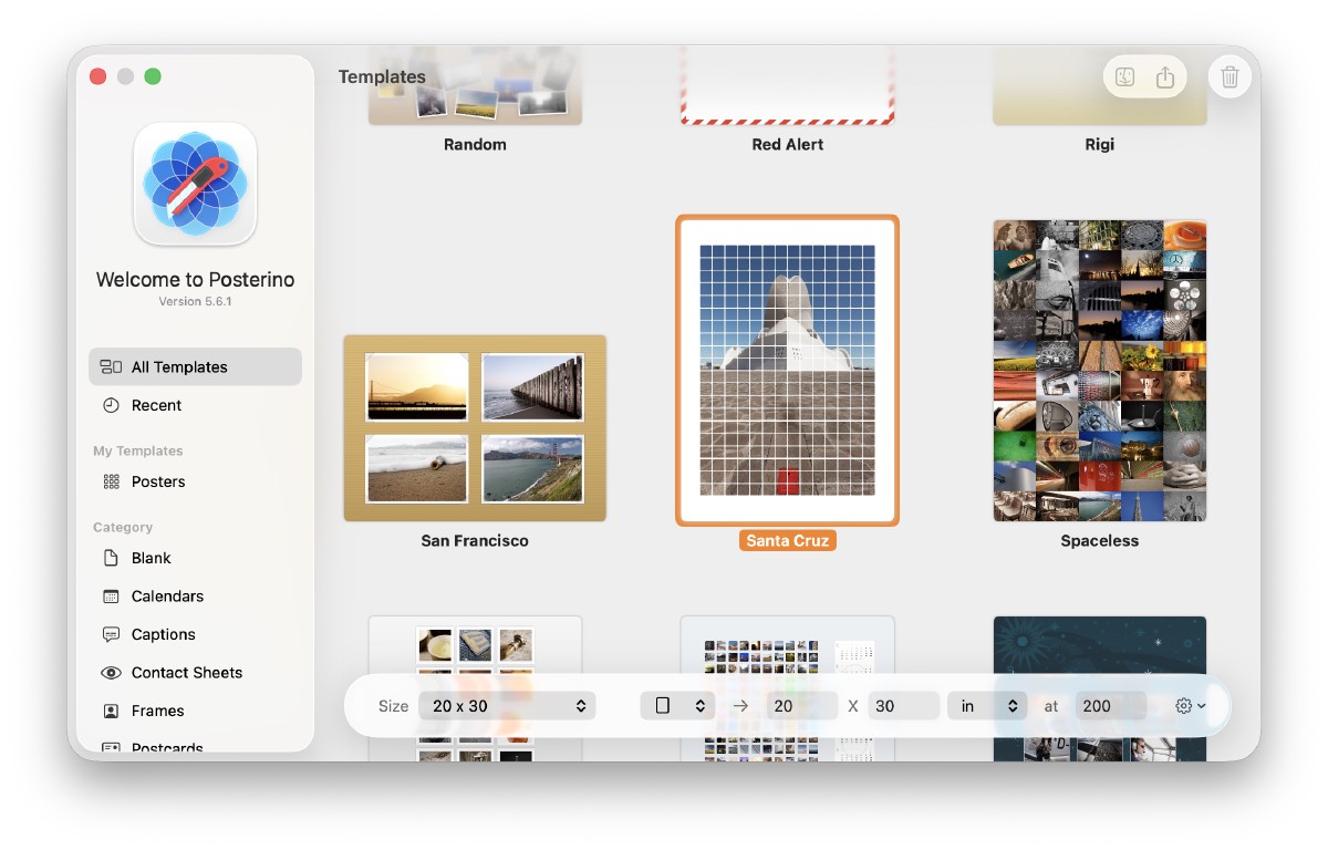
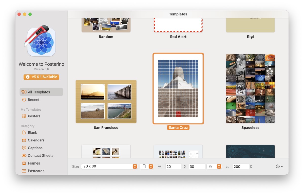
I also used this opportunity to refine existing features and make certain actions easier to find. For example, when a user selects a custom template, toolbar buttons now appear to show the template in Finder or delete it — actions that were previously buried in a context menu. I also added a new action to share custom templates with friends and family.
Conclusion
This redesign gave me a good reason to take a critical look at Posterino’s UI, check it against Apple’s HIG, and spot opportunities for improvement.
Liquid Glass also helped solve a few UI/UX issues in my existing design. I had some custom controls I was never fully happy with; now there’s a consistent, universal way to indicate importance. Switching back to standard controls feels good and right.
For Posterino, Liquid Glass works beautifully: the content takes center stage, and the UI feels more focused and to the point. Overall, I’m finding myself enjoying this new design very much.
References
- Liquid Glass at Apple
- Adopting Liquid Glass developer documentation