I admit, I’m not a designer. I’m a coder. But like the critic longing to write his own novel, I have this craving to design. Starting with my very first computer with a graphical user interface, I fell in love with icon design. Back in the days when app icons were 32 × 32 pixels of black and white, things were easy. Also, 256 colors I did manage. Then app icons started having up to 1024 × 1024 pixels, thousands of colors and Skeuomorphism came along the way. And with that, I reached the end of my skill set. My adventures into the world of icon design were over.
While working on the last major update of Posterino, I realized that the app icon was no longer in line with the visual language of modern macOS. I knew, something needed to be done. Since the days of the hight of Skeuomorphism, time has passed and macOS has materialized into being much more flat. Flat for me meaning: The design being more approachable for people with a limited skill set like me. So, I allowed myself to give it a try.
The game was afoot.
Dissecting the current app icon of Posterino, it became obvious to me. The cutter knife was still as sharp as in its first days, but the rest of the icon no longer fit the shape.
Naturally, I first tried to stick with the concept of the existing icon and keep the idea and the frame.
But those sketches felt like a dead end. It was time to step back and reflect on what the app icon should be all about. For me, the idea, the icon should represent is, and always was:
“Assemble a new whole from individual parts in endless ways of creativity”
This essence is rooted in my vision for Posterino and in the meaning of the term collage:
“A technique of art creation by which art results from an assemblage of different forms, thus creating a new whole.”
The core ideas here are assembling, individual parts and new whole. I stepped back and tried again.
Previously, all Posterino app icons featured tiny “photos” as the building blocks of the collage. This idea was lost by the new approach. Or wasn’t it?
“Every block of stone has a statue inside it, and it is the task of the sculptor to discover it.” — Michelangelo
Then it hit me. The idea was not lost, it was still there. But on a much more abstract level. The new sketches reminded me of something also built from individual parts, and also forming one pice of art. I approached my material under the new angle and tried to reveal, what was inside it.
Then the pieces fell into place.
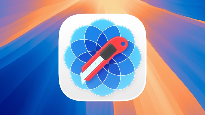
The new icon consists of tree parts: A canvas, a “blossom” and a cutter knife. All by themselves references to the process of collage creation.
The canvas is the foundation on which the individual parts of the collage are arranged. The frame holding the composition. Here, as a square with rounded corners, referring to the way apps look like on macOS and iOS today. Making the icon instantly recognizable as an app.
The cutter knife as the principle tool of the collage artist. The original knife of the app icon was designed by Marcelo Marfil for Posterino 2. Thanks to the wonderful work of Marcelo, the knife still fitted perfectly, and I just did some cleanup and color adjustment to align it with the style of the new icon.
And finally the blossom. It reminds of stained-glass windows. Where small pieces of colored glass are arranged to form patterns or pictures. Held together traditionally by strips of lead. The individual photos – which were recognizable in the previous Posterino app icons – are now an abstract concept. The individual parts making a new whole.
The basic building blocks of the blossom aren’t circles. If you follow a “strip of lead”, you can see, it is an infinite loop. For me, a reference to the infinite possibilities of creativity or creativity itself. The endless loop, to be exact, is a Hypotrochoid, a special type of Cycloid. A subtle hint to the name of my company, Zykloid Software.
I think, the new app icon is not only a refinement of the identity of Posterino, but also a vision for its future.
To rephrase Michelangelo:
“Every app concept has an iconic representation inside it, and it is the task of the designer to discover it.”
Just as Michelangelo saw the statue within a block of stone, designers envision the icon within the app’s concept. With careful exploration, ideation, and execution, designers can reveal the essence of the app in its icon, capturing its unique personality and features. It’s the designer’s job to reveal the app’s “statue” in the form of a compelling, memorable, and recognizable icon that communicates the app’s core message to users.
For me, the design process has been about careful exploration, patience, and not being intimidated by the fact that I lack serious design skills. Looking at the new icon now makes all appear so obvious, so easy, so simple. Forgotten are all the failed attempts. Forgotten is all the doubt.
I’m still not a designer. But I still love to design.